The redesign of the Paytm Ads Web App project was my first project in the company, where I was solely responsible for all the design decisions. It was a remarkable experience working with a diverse team from various business units and collaborating with stakeholders to establish a clear requirement document and project objectives.
This project provided me with a comprehensive understanding of both our customers and business needs, resulting in the creation of a product that was mutually beneficial. In short, it was a thrilling adventure!
Redesign Goals
- To empower our users to make an informed decisions about the PayTM Ads products with ease.
- To help the business get even more refined leads, while increasing conversions with an improved user experience.
Design approach
I took a three-step approach as we were following the Agile development cycle. I began with analyzing the website, looking out for problems in the existing flows, pain points and usability issues. Followed by a thorough competitor analysis, and finally creating the Lo-fi wireframes to discuss the improved user flow and design with the stakeholders.
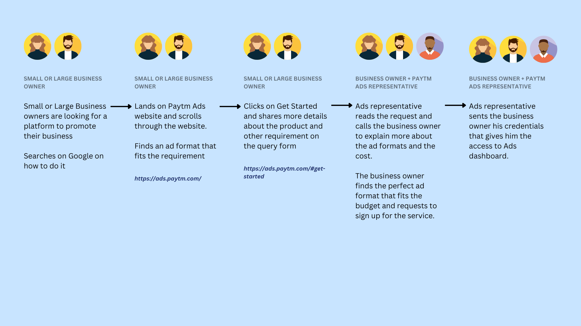
User Persona & Flow
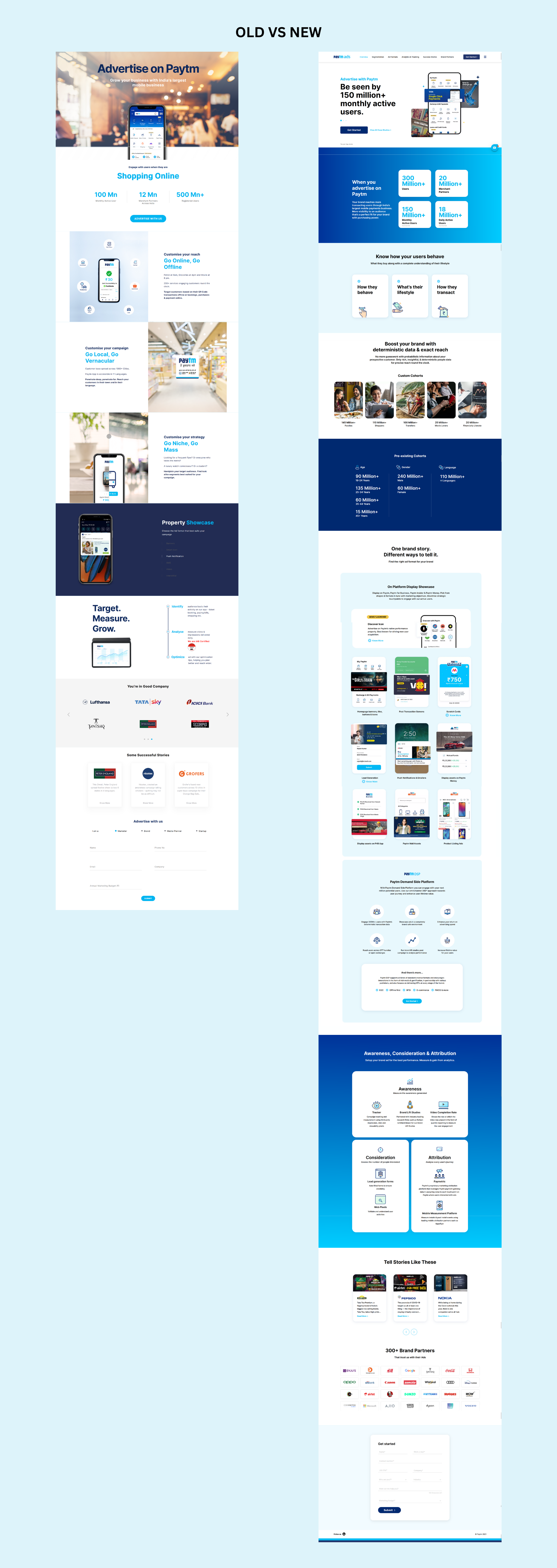
Old vs New Design
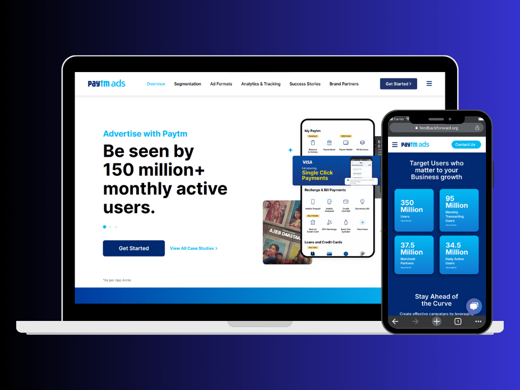
The old website was not mobile friendly. Therefore, optimizing the new design for mobile devices was on high priority. While redesigning the website, I ensured the layout to be compatible with various screen sizes and orientations and made the font readable for all type of users.
The old landing pages lacked data to help the user make an informed decision, resulting in low conversions. With the new design we added data-driven insights, allowing decision-makers to quickly view important statistics like active users and merchant partners and make an informed decision. This led to more refined leads, and resulted in better conversions.
I also improved access to product information, such as unique selling points, extensibility, and ease of use, by adding compelling graphics and real-life examples to highlight its capabilities.
Lastly, I worked on making the navigation better with the addition of a vertical, always-visible navigation bar, making it easier for users to find the information they need. Moreover, making it SEO friendly by structuring the content in the right format to improve its visibility on various Search Engines.
Conclusion
The new design not only offers a sleek and contemporary look, but also streamlines the on-boarding process for users, improving navigation on the website.
The impact of these changes was immediately apparent, with a 3% increase in the Click Through Rate within the first few weeks. Additionally, we received our first successful sign up and on-boarding in the first month following the website relaunch, making the project a resounding success.

Leave a comment