About HOHO Bus Tours Website
HOHO (Hop-on, Hop-off) Bus tours is a microsite of isango! that is one of the largest inventory of HOHO bus tickets. The goal of the website is bring all the HOHO supplier at one place, creating a better connection between the user and the product.
Note: The company has now been acquired by CitySightseeing.
What is a HOHO to a user?
As a product – A bus that takes you around the city’s main attractions. It is cheap and safe to travel. You get to see a lot of places in a short span of time.
As a website – A place where user can buy their HOHO tickets online to save time and to avoid last minute availability issues.
Why the need of a redesign?
HOHO has been isango!’s largest trading website. Although the existing site was doing well in terms of Conversion Rate (CR). However, when it came to user experience, it was not doing a great job. HOHO as a product was selling but the customer experience was not satisfying.
Business Goals
The company aimed to increase the CR, ABV and reduce the bounce rate on the key pages. To support this, the product & design team collectively decided to rebuild the brand image as energetic, warm, empathetic and inspirational.
People value websites that are easy to navigate, and this simple business model translates to a simple e-commerce marketplace, making the process of finding the right HOHO ticket for a travelers and comparing them among the huge list of competitors & routes easy.
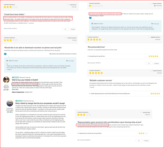
Market Research & Analysis
As the Lead Designer of this project, I went analyzed several user reviews on various channels like Feefo, TripAdvisor etc, and concluded the following:
- The key problem was the way the information was delivered about the product – With so much data to display like, routes, bus timings, pick-up and drop-off stop and realtime information like the on-going Parades, Elections etc, leads to user frustration.
- Negligible presence of personalization – led to the low likelihood of users converting on their first or the next visit.

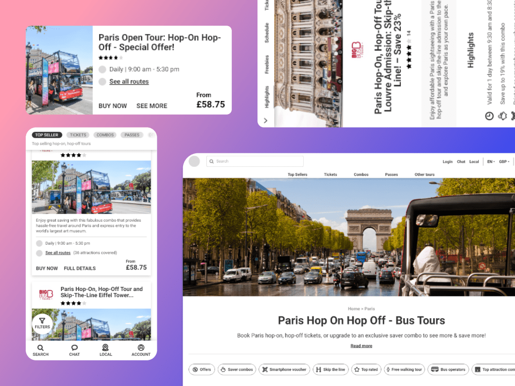
Competitor Analysis
Analysing the sites of our direct competitors (mainly our suppliers and other dedicated HOHO sites like TopView, BigBus, Open Tours etc.) and indirect competitors (Viator, Get Your Guide, Klook, Headout etc.) The analysis was done with 4 things in mind, Tone and copy, Good features, Page speed & Design.
| Website | Tone and copy | Good features | Page Speed | Design |
| Top View NYC | 1. Considering HOHO as an adventure ride.2. Creating a fun element by adding HOHO videos on the home page.3. Giving tips like a local with articles at the bottom of the page. | 1. Ticket booking option on the header2. Use of video as hero image3. Using card style for comparison of tickets4. Local travel guide and tips5. USPs highlighted using icons6. Good use of filters7. Cross-selling of attraction passes | Mobile – 14Web – 45 | Minimal UI with good use of brand colours. Good placement of CTAs throughout the site. Good use of icons with induced brand colors creating a uniqueness. |
| Big Bus | 1. Shouting about the brand since the beginning of the journey.2. Crisp content with a clear message of what the bus does and what a user can do with the product.3. Dedicated pages for attractions that each route covers that includes details like timings, opening hours etc. | 1. Ticket booking option on the header2. Good placement of search next to the brand name creating a flow.3. Using card style for comparison of tickets with color distinction.4. Good highlight of routes with description.5. USPs highlighted using icons6. Good use of filters7. Cross-selling of attraction passes | Mobile – 26Web – 63 | Minimal UI with good use of brand colours. Good placement of CTAs throughout the site. Good use of icons with induced brand colors creating a uniqueness. |
| City Sightseeing | Plain content with no excitement or uniqueness. Simply talking about the brand’s USP and its top destinations. | Mobile – 48Web – 80 | Good use of brand colours and vibrant vectors to bring out the overall look and feel of the website. | |
| Open Tours | 1. Catchy headings and good supporting content.2. Highlighting USPs in a nice way with icons and specific to each product. | 1. Ticket booking option on the header and hero banner.2. Using card style for comparison of tickets with color distinction.4. Good highlight of routes with interactive map.5. USPs highlighted using icons6. Smart itinerary to make the decision process easy. | Mobile – 14Web – 61 | Neat and minimal design approach. Good use of typography creating visual separation between the headings and the supporting text. |
| Foxity | Plain content with no excitement or uniqueness. Simply talking about the brand’s USP and its top destinations. | Mobile – 73Web – 77 | Old style UI and too much clutter on the homepage. | |
| Golden Tours | Plain content with no excitement or uniqueness. Simply talking about the brand’s USP and its top destinations. | Mobile – 39Web – 93 | Good use of brand colours. | |
| Red Sightseeing | Plain content with no excitement or uniqueness. Simply talking about the brand’s USP and its top destinations. | 1. Use of bus video as hero banner.2. USPs highlighted using icons | Mobile – 34Web – 73 | Neat UI with good use of brand colours. |
| Extrapolitan | Plain content with no excitement or uniqueness. Simply talking about the brand’s USP and its top destinations. | 1. User is able to book from the first fold as they have introduced a form asking about the pax detail and city on the banner which later becomes a sticky.2. Explicitly showcasing their partner logos on the homepage. | Mobile – 13Web – 48 | Neat UI with good use of brand colours. |
Inspiring features on the competitor sites.
- Ticket booking option from the home page. Majorly all the sites have ‘Book ticket’ option on their header that can be accessed from all the pages.
- USPs and booking steps highlighted in an attractive and easy manner.
- Easy ticket comparison by keeping the tickets next to each other, for better understanding.
- Detailed route map
- Placement of search – in continuation with the brand name
- Advance Filters and Sorting
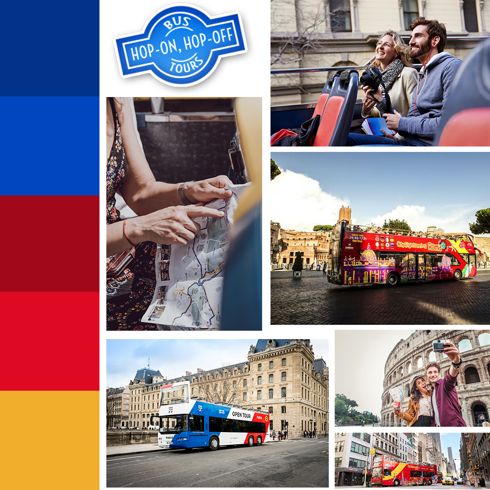
Moodboard
This mainly consists of Color palette, typography, texture patterns, photo selects etc. that would give you a context of the actual look and feel of the website.

Proposed Typography
Current: Ubuntu Font (Sans-serif family)
New: Roboto (Primary) – Headings and body text
- One of the most legible fonts in Sans-serif and also used as the primary font in isango!’s website.
- Creates a polished look and feel, complimenting the minimalist design structure.
Permanent Marker (Secondary) – Banner text and highlighters
To set a warm, personal and casual tone of the website, and give a personality to the website.
Proposed Color Palette
Goals
- Building user trust and increasing website engagement that will lead to an increased conversion rate. Increase exposure of our suppliers, which would in return give more credibility and trust.
- Personalization – show deals, offers and bundles based on user’s preferences rather than generalized options.
- Discoverability – Ensure that the website continues to be well optimised for SEO where we drive the majority of our traffic.
- Seamless Experience – Making the booking experience seamless for a user without going too much back and forth / Reducing number of steps to booking as this isn’t a complicated/high involvement service we are selling
- Performance – Ensuring that website speed/performance is not compromised especially now we are seeing more ‘in-destination’ bookings.
Features Proposed
Based on our User and the Business derived from the data & general trend, and taking a widget based approach.
- Route Widget – To educate users on the different types of routes available in each destination or for different supplier – starting points, end points, etc.
- Attraction Map – To emphasize attractions covered in respective routes, as it is one of the key decision making factors (aside from price).
- Meta Data Widget – To emphasize on essential information to help user make an informed decision like Frequency, Operating hours & Pricing.
- Cross-Sell Widget – Seamlessly adding cross-selling products to increase ABV, without disturbing the primary booking flow.
- Up-Sell Widget – Recommending best product for the user based on historic data leading to an increase in the ABV.
- Inspiring imagery – Replacing plain images with colourful and exciting images that with more humans in it.
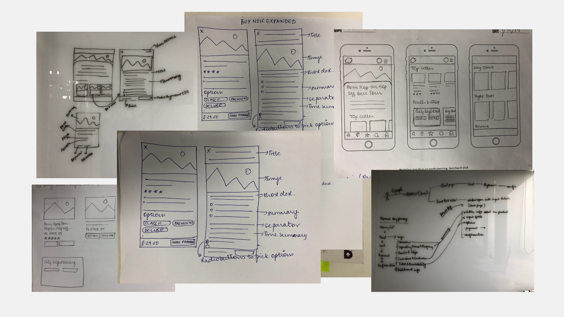
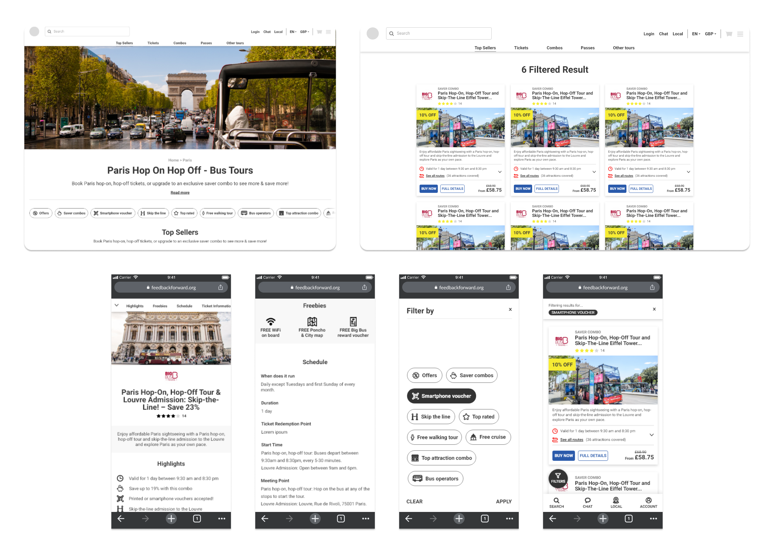
Low-fidelity Designs
High-fidelity Designs

Leave a comment